Friday, April 29, 2016

End of Module Evaluation OUGD406

In this module I was able to be my most creative with the briefs. I was able to explore more traditional print methods that I don't really use within my normal design such as letterpress, watercolour, scenography and photography. In the secret 7 brief I was able to create Album covers that I could submit into a competition which I enjoyed because it is a way to get my work into the real world and I could be more creative. In the Banknote brief I was able to create my own currency informed by the research I had done about patriotism and by asking people what they thought represented the UK. Within that project I had to deal with a problem with letterpress and change my idea around this within a short space of time. This helped me to problem solve as I was happy with my final outcome.
For studio brief 03 I had to work in a group which has not been my strong point in the past. However within this task I was able to contribute and take more of a managing role gathering the group together and sharing my ideas. This resulted in the group choosing my idea of making the exhibition its own bank and using my logo and other designs. However as a group there were improvements that I know to do for next time I present. Studio brief 04 was a brief were I was able to think about first year and create something to give to next years level 04 students. I thought back to me in freshers and made a publication that purpose was to entertain to show what the reality of first year was. I liked this brief as I was able to be creative using Illustrator which is what I have been learning to use over the year but also because I could make a publication which is my interest.
Overall this module has been beneficial to my progression in level 4 and has helped me to see what is possible for me to explore more with next year.

Thursday, April 28, 2016

Speaking for Experience Final Outcome


I printed my final outcome on 200gsm paper so that it was of a good quality and would not easily rip. Now that the work is printed I am happy with the bright colours as they look playful and fun along side the illustrations. I had to add two pages to the front of my book as I forgot to make it a multiple of 4 however it still looks professional. I was unsure on how to bind the book but decided on staples as it would be easy to mass produce and works well on the little book.
 I am overall happy and think that my book can help first year students to see what they can expect in there first year and give them an idea without giving to much boring information.

Final Banknotes


My final outcome is three banknotes made for the North, South and Midlands of the UK not including Scotland, Ireland and Wales. They work together well as a set because they form a bigger picture. I used silver type for the numbers however maybe I could have made them stand out a bit more from the dark blue sea background. I like the effect that the sponge water colouring give because I think It adds texture and will make it look unique in the exhibition. If my notes were to be produced in the real world I would make them from polymer as they stay cleaner and more secure. I also could have the notes made out of a material that could make people be able to draw on the notes things that make them proud of the UK but then it would just wipe off. The idea behind my note was to make british people feel more patriotic and even though my idea changed multiple times I am happy with the final outcome and think it works well to my concept.

Wednesday, April 27, 2016

Book Cover Design.

I was unsure of what shape I could use for my front cover design as inside was a mix of squares and circles. I was also unsure of the colours as I had a mix of colours.
I decided to so minimal on the cover with no illustrations because it will draw peoples attention to the title and make people want to look inside to see what the 'Reality' is. I used the Aqua blue colour as it is modern and relaxing and contrasts the bright fun colours inside. I added my name to the back and that is it so it would not give away what was inside and to follow my minimal theme.


Monday, April 25, 2016

Research Traditional Print Methods

We were told that for this project we needed to use traditional print methods to produce out banknote therefore I have done some research into what traditional print methods could be better than digital print and production.
With letterpress once you've created your letters, you can keep inking up your type for mass production as well as you can use a number of ink colours and stock easily. A benefit of screen printing is that you can print onto a variety of stock including material. Another positive factor is you can scale your designs up or down. It is also great for mass production. After looking at this research I could use any of these methods to create my banknotes.

Final Presentation


For our final presentation we all talked about our concept and aims and about what we had designed and the reasons behind it. I think that the presentation went well because it flowed and we all spook as well as the presentation had a clear theme.


Final Feedback
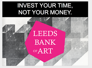
  • They loved the idea behind investing time instead of money
  • Issues with the use of the logo and it being all branded similar to LCA
  • They could not visualise how the banknotes would fit into the space.
We did not get picked to move forward in the competition however I still am happy with our outcome and how we worked together as a group. If I was to do it again I would create to physical copies of what I was talking about to give to the tutors and maybe be more visual rather than using mock ups.


Producing BankNote

 I started to produce the banknotes by creating a stencil of the shape of the place I wanted. I then used them as a guide to do my watercolour sponge effect. I used two different shades of blue and green to add depth to the effect. I then letterPressed the numbers onto my note using a silver ink mixed with some white. This makes the note look more like money as the silver represents the wealth and worth of money. I then bought a silver pen and did a silver strip down the side of each note the that there was something the same on each note that would tie them together.


Exploring a new alternative


After thinking about new ideas I decided it would be good to experiment with watercolour as it would be unique and there are many different ways I could use it. I started by trying different methods such as blowing through a draw and sponge effect. The effect I liked the best was using the sponge because I liked the texture it gives and the subtle blend of colour. I thought about what size I wanted my banknote and knew I wanted to display 3 notes in the exhibition and I have 21cm x 26cm to present my work on so I needed my 3 notes to fit right with this. I decided on using the normal rectangle money shape as It would fit into wallets and purses and still look professional. Im making them 4.5 inches by 2.5 inches.

I then had the idea of including the shape of the country using the watercolour effect. After I did my research I realised that everybody that I questioned had very different views of what they were patriotic about depending on where they are from and there views were quite stereotypical. Therefore I could not include what they said and just show the country as then people can look at the banknotes and think themselves about what makes them proud. I also still what the 3 banknotes to work well together.

Exploring Bank note idea

I started to create my letterpress design however soon came across some problems, I spent nearly two hours putting the Times type at 18pt and managed to get 3 lines of text done, however when I went to pack it so I could leave it till the next day, I didnt do it properly and all of the type fell out. I also realised that there would not be enough of certain letters such as I for me to complete the text. This is when I realised that I would need to change my design idea, however I still know that I want to use letterpress within my banknote.

Development and Third Critique


Using the research from the last critique I created some basic illustrations and made them into a collage to show what people said that they liked about Britain. I used three basic colours red, green and blue. However I was not sure wether I liked the idea or the style anymore after I looked at my outcome so I began to develop my ideas into typography.
I then had the idea to use text to write out all of the Answers I got but then use colour to show the shape of the country. However my currency is not made for, Ireland, Wales and Scotland, therefore I took them away from the shape. I added the prices on the notes however I will not be using a pound sign as that is what the current sign is for the whole of England. I liked the idea of having the notes be interactive to each other and work as a set like how past British coins have worked http://www.stainlessvision.com/blog/you-got-royal-shield-arms.
I then had a critique where I asked the following questions,
  1. Do you like the text idea or the image?
  2. Which seems more appropriate?
  3. Do you like the colours used?
I got a large variety of feedback.

  •  The text map designs are more visually appealing and unusual
  • The text is playful yet effective, banknotes are like a jigsaw
  • The map idea is engaging
  • The text map is the best idea however looks a bit flat at the minute
  • The colours are appropriate to the design but you could experiment with alternatives.
  • Experiment with different shades of colour to add depth
  • There is to much going on in the illustration design


  • The text would look great done by letter press
After looking at this feedback I am not going to continue the illustration designs and focus more on the text idea.

Development of pages

I then began to create my term pages that would split up the circle pages. I wanted to use a different shape so I looked at the idea of a triangle but did not think it worked well. I decided that a square was more effective. I also was unsure on colour but decided that I could make the colour relate to the time of year that the term is and the stereotypical weather for that time of year.
Term 1 is September to December, so a majority of the weather is Autumn which connotes to orange and falling leaves
Term 2 is January to March which usually has rainy and snowy weather which reminds me of the colour blue.
Term 3 is April to June which is the start of summer which makes
me think of spring and flowers and the colour green. I think this works well to separate my pages because it gives contrast between the circles.

Sunday, April 24, 2016

Developing and changing

There was a few things we had to change but I was in charge of changing what they said about not hiding the feedback but having it displayed.
I had the new idea to split the feedback into Cashier 4 and Cashier 5 like a bank but have them at either side of the boards hiding the cabinet. We would still have the Feedback Cheques however they would be stuck onto the wall so that everyone could read the comments. We all changed what was  needed and added them to our presentation ready to present again.

Friday, April 22, 2016

Developing Ideas for Speaking from Experience and feedback

I began to develop my ideas by creating illustrations. After the last critique I believed that this was the best way to create it. I creating the illustrations that I thought could resemble my point, I used a range of colours that were bright and engaging because I wanted the book to be fun and entertaining. I made the pages circles to make a consistent theme. It also frames the type and makes it stand out well. The font I used is Helvetica as I wanted the text to be easy to read when flicking through.


After I completed my main pages I was unsure of wether to keep the backgrounds white or add colour I tried both and then asked for peoples opinion. This was the feedback,
  • The more colourful the better
  • use colours that are nice and friendly
  • colourful is better
  • White makes circles stand out more
  • More colour is nice, keep it consistent 
  • Colour is more engaging
  • The colour looks more appealing 
After the feedback I decided to change my pages backgrounds to colour. I decided o make them a paler shade than the circle to avoid unappealing colour combinations and because it is soft and subtle.


We were also given blank brief templates to help us with our task so our aims were clear.

Tuesday, April 19, 2016

Speaking from experience Critique


I began by looking at dimensions. I wanted the publication to be small and something that is easy to carry around or fit into a pack with other information. I decided on 12cm by 12cm. I had two ideas I could either make it full of photography or illustrations. I will slit my book into terms to separate information and I want it to be more minimal using basic shapes such as squares and circles. I was unsure on the title but that is something I could ask for peoples opinion on. I wanted my publications tone of voice to be more entertaining than informal as I think everybody's university experience is different and I wanted to tell a little story though my book to show this. I also wanted to show positive and negative aspects of the year instead of being to negative or sugar coating the experience.


For the critique I asked the Questions
  1. What could I call my publication?
  • First Year
  • Guide to Freshers
  • First Year Graphic Design
  • An Emotional Roller coaster
  • life
  • Uni
2. Illustrations or photography?
  • Both
  • Maybe illustrations will relate to people more
  • Either would work
3. Any other suggestions?
  • You could use different shapes in different segments
  • Look at type and make it engaging
  • Use a friendly type
I also listened to some of the tutors overall comments and was told to not mention stress in my book as you do not want to scare the students and make them not want to do the course, therefore I need to change some of my page ideas. What will this Achieve, I want it to let the students know a realistic experience of university so they know more of what to expect as they may be hearing many stories or not know anyone at uni.

Monday, April 18, 2016

First Group Presentation

I had the idea that to create our presentation we could create a powerpoint show on our google accounts so that we can all edit the same presentation together but from our separate laptops at anytime. This was really helpful as we were able to upload all our work and make the presentation flow well including everyone contributing.

In the presentation we all took turns speaking our concept and explaining our design choices. We then got feedback from the tutors and level 5 students which was,

  • There is an issue with logo being to similar to ours, we would need to ask marketing if that is okay
  • The First Direct part of the leaflet is to big
  • We need to use the print more 
  • They like how we are interactive however we need to display the feedback insted of having it be hidden away
  • They liked the idea of the coins
  • They liked the concept of investing your time
  • The hashtag wont work because LBA is Leeds Bradford Airport.
After this critique we know what we need to change for our next presentation

Sunday, April 17, 2016

End of module evaluation

In this module I learned design principles and created two publications. I used my inspirations to create, develop and produce my publications. Book Design has become a passion of mine and because of my love of books I knew I would love this module. I was able to create a leaflet on my favourite thing I learned in the module (colour theory) and create a book on a interest of mine. Starting studio brief 01 I was unsure on how to make the information appealing within a small publication. I experimented with different themes and decided on creating a geometric design which is something I had not done before in my designs.

For my large publication I wanted to create a book that had content that was close to me.
I decided to create my publication on positivity because I have lost somebody close to me due to depression and it is a subject I feel strongly about. Within my publications I was able to use my own photography, illustrations and use some more hands on approaches which I would not have considered before the module began. I really felt like within this module creating the publications lead me to be most creative by doing what I loved and being able to create something that was all my interests. Something that I found stressful within the module was the printing and cutting as my publications are usually get uneven at the sides after I fold. I took inspiration from books such as calm and design websites such as The book design blog. I really enjoyed creating my book and was happy with my outcome. I had created a book in Alevel but it was no where near the standard of the book I have created this year, and I never bound a book before this module.

This module helped me to learn more about the production of books enabling me to learn binding methods which has helped me to create publications in other modules and gain a stronger interest in book design. This module helped me inform my design decisions by helping me gain knowledge in colour theory, figure and ground, folds, grids, canon and typesetting. This knowledge has helped me in all aspects of my design in all my modules. I hope to continue doing book design in level 5 as it was something I was interested in and enjoyed to do.

Final outcome large publiction

I am pleased with my final outcome for my book because it fits well with the intended theme. I wanted the book to be a relaxing reading experience and I did this many ways.
I used lighter colours and blue to create a calmer feel. I used a grid system on my written pages to create active white space and flush left alignment on my text as it is the most easy to read. I used this more modernist approach as I wanted my book to look professional and something you could trust. I also think that the consistency helps the reader to have a more calming reading experience. The font I choose for the articles is Baskerville, I wanted the text to be a sans serif formal font to look professional and informative. For my activity and quotes pages I used the font Bromello as I liked the cursive hand written style as if seemed more positive and stress free with its curves and rounded edges. Even though the book consists a mix of photography, Illustration and typography I still think the pages link and work well together along with the front cover which is made to grab peoples attention without giving away what the content of the book is.   


I hand bonded the book myself using white thread as I thought it most appropriate to the style and cover. I used the Laser cutter in digital print to cut the edges of the book and to cut out the circle of the O I used a scalpel.


Speaking from experience Initial Ideas

When getting briefed I began to think about some initial ideas, I knew I wanted to create a publication as that Is what I enjoy creating the most. I thought about what I was like coming to uni and what I would have found useful. Something that I found when I started uni is that I really did not know what to expect because when I asked people about uni everybody said different things because there courses were a lot different. Therefore I didn't really know what to expect from the course and wether I would enjoy living away from home. I started by creating a mind map to show what happened to me within the terms which I wasn't really expecting. I thought that I could include this in my publication with illustrations or photography but have very minimal content, just the main points. I am now going to create a plan and talk about my ideas in crit.