Friday, April 28, 2017

Developing the women


Taking inspiration from 1970s British fashion I began creating my women which is the main image on my poster. I want her to look strong and powerful but also look like she is from the 1970s. I want her to wear a suit and have a powerful stance. I have the suit material but I needed to carefully cut it out into a shape of a suit. I decided to pull the pose myself and photograph it so I could know what shape to create the suit.


In illustrator I created a suit shape and printed it out to use as a guide. I then cut out the shapes and sewed them to the poster covering the edges so that the material will not fray. I feel the material is affective at making the women look serious and draws attention to the fact that the women made mens suits.

Thursday, April 27, 2017

End of module self evaluation

Overall I really enjoyed responsive as a module. It is good to be able to design for a real brief and it is a module that has a lot of room for creativity. Within responsive I was able to pick briefs that interested me and experiment with different ways for production. I was also put out of my comfort zone when I needed to work in a collaborative group with people from another discipline. I surprised myself by taking more of a leading role in the group and I was able to do more briefs then needed due to my time management and organisation. I am looking forward to taking part in more competitions in level 6.

Wednesday, April 26, 2017

Project Report

Evaluation

I chose to do UK Greeting cards due to the openness of the brief and as I have always took an interest in card and stationary design after working in a card shop in college. Initially I saw the brief as a chance to create designs for a subject I was interested in and be able to experiment. It would also allow me to explore more design processes than most of the other briefs. I felt that the brief went well and I was able to create a collection that is unique and was presented in a professional way. Overall I really enjoy and was happy with my outcome which I submitted.

I chose to take part in the Papyrus brief because it was to help the issue of suicide prevention though stress, which I felt was a good cause. I enjoyed doing this brief as I was able to illustrate which I don't usually do and I created a time-lapse video. I felt that my final design worked well as a colouring page and put across the message that you are not alone and there will always someone there to talk to.

I decided to enter to Shy Bairns because it supports the talent of people who call the north their home. I wanted to be able to submit something which represented the north to me. I was able to do only photography within this brief which was refreshing as it is something I enjoy but don't usually get to do. I was really happy with my final outcome which was portrait photography of my Grandad. My work was picked to be featured in the zine.

I have always loved book design and is something I am interesting on pursuing in the future. Therefore I was excited to do the Penguin competition. I saw that a book I have read and enjoyed was one of the categories so I was able to create a cover with my own interpretation on the book. I enjoyed the research and developmental stages of the project and was very happy with my final outcome. I feel like my cover design is unique as it focuses on the law and racism with inspiration from the American Great Depression, rather than going with more obvious approaches. I was also able to use the method of paper cutting which is something I don't usually do.

I was drawn to the graters competition brief as it was for a good issue and was open to creativity. I enjoyed being able to create a poster that would give a across a important message and I was able to use shop tactics through the use of photography and colour. I was happy with my final outcome and would like to do a brief like this again.

I decided to do the Up Yer Sleeve brief because Secret 7 was cancelled and I really enjoyed designing an album cover last year. It was one of the briefs in which I had the most room for creativity and I really enjoyed being able to develop ideas based of different inspirations. I think my final outcome represented the song well and was a modern twist on a 80s classic.

I took part in the Bear brief along with two illustration students, Penny Pryce and Louis Byrne. I contacted both of them after seeing their work and liking there different styles. I decided to do the bear brief because it was a chance to design something for a younger target audience which is something I don't usually do. In the group I was the organiser and the person who put together everyones work. I also created typography and the layouts for the backs of the cards and put together the submission design boards. We worked well together as a team because we all had different strengths. My strengths were digital and my weakness is illustrating which is why I wanted to work with illustrators. We all equally shared the work load and we were able to worked together to create a successful outcome. Overall I enjoyed working as a collaborative group and felt our final cards will stand out against competition for its consistency and for their humours and educational content. 


Tuesday, April 25, 2017

Submitting Bear

Overall I felt the collaborative project went really well and we worked well together as a team. I feel our cards are fun and engaging due to the bright colours, humours illustrations and interesting facts. It is different to the cards that BEAR already produce which I feel will make it stand out within the submissions.They also have a strong synthetic style which makes them noticeable as collectable items. Our card collection has great potential and will encourage children to read more stories.


Submitting UK Greetings

Overall I am really happy with the designs I submitted. There was a lot of change and development due to research and feedback and I feel like the final outcome is unique to other cards that UK Greetings already has which would make the stand out. I have a clear target audience and have used a consistent style throughout my collection. My idea also has room to further develop into different music genres. I feel that by printing and photographing the outcomes that this will also make my designs look more professional when I submitted to the competition.


Up Yer Sleeve _ 9


My final choice was this cover as I included elements from the video to create a tropical pattern. The clothing is swimwear what you would wear on holiday and the image in the background is fun and bright and is taking of palm trees. Overall I am very happy with the outcome and had a lot of fun creating an album cover. I hope there is another opportunity next year to to another album cover brief.

Up Yer Sleeve _ 8


 I narrowed down my final designs to these three with different styles. I feel they all work well with the song and represent it in different ways. They are all bright and colourful which represents the fun of the song but also the fashion of the 80s summer wear. They also all have a tropical and holiday feel. I can only submit one so I need to make a decision on what is the best one for the song.


Up Yer Sleeve _ 7


After the feedback I received I experimented more with the photograph and colour without image. People really like the pink sky coloured photograph however I feel that this is to serious for the silliness and light hearted song. I also feel like it reminds me of more modern ibiza remix style songs. Therefore to jazz up the design I added a few saturated colours together. This made up for fun and interesting as the palm tree and sky was made of many colours.

Up Yer Sleeve _ 6

After I created my covers I thought I needed some feedback on what which designs are best. This was my feedback.

  • All of the designs are very appropriate to the song
  • I find the palm trees difficult to see what they are but I like the bright colours
  • I think you should try making the clothing have the palm tree edits as a pattern as it is more bright
  • The palm tree photograph is good and does not look like it was took in Britain.
  • I think you should look more at the saturated images without the clothing on top.
After my feedback I am going to create some developing designs before I pick a final submission

Thursday, April 20, 2017

Up Yer Sleeve _ 5


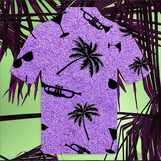
In the music video people were tropical shirts with bright patterns. This was common in this time era. Therefore I wanted to experiment with the idea of creating a fun pattern using the objects I identified that relate to a holiday and the music video.

I took a photo of the sand and used that as a background texture. I changed the sand to purple to make it look more bright and fun. I created silhouette images of palm trees, sunglasses, cocktails and trumpets and created a mix match pattern. I also created outlines of clothing items giving them the pattern. I used colour saturation to change my palm tree image and layer the clothing ontop. I like these cover designs as they look tropical and have more elements that relate to the song.


Monday, April 17, 2017

Up Yer Sleeve _ 4

When listening to the song it makes your think of a tropical hot place. I have palm trees in my garden and since I am not in a tropical country thought they were the next best. I decided to take a photograph that would make the palm trees seem like they were abroad. 


I decided to experiment with my photograph adding bright colours. I also created some patterns combining the photo in different ways. I liked the results of this as it resembles the fun nature of the song and the bright colours of the holiday fashion. However the pattern began to be less recognisable as palm trees so bring it back to the holiday vibe I illustrated some sunglasses which are worn in the music video. I want to get some feedback on my designs but also develop some more ideas.


Friday, April 7, 2017

Type Development

Before I began my poster I needed to find out what material would work best. One material was thicker than the other. I did a sample on each and found that the thicker one was better as it felt like it was less likely to rip with the detailed stitches and it would look better as it was less see through.


I began by doing the flowers to make the poster look feminine. I took inspiration from embroidered flowers I had seen online. I free hand created my own flower design using bright colour threads to stand out.

I wanted my main type of Equal pay to stand out and thought the best way to do this was through cross stitch. I decided to plan the letters before creating them by using a grid. This would make it easier to keep track of what I was doing while I was stitching. I also added some flowers to make it more detailed and feminine.


Wednesday, April 5, 2017

Collecting Materials


After creating a basic plan of what I wanted the poster to look like I needed to collect materials. I only have a small budget and because I am creating an exhibition piece I only need to worry about creating one poster and gathering only a small amount of materials.

I have not done embroidery before therefore this process will be trial and error. I decided to go to South Shields market and look at some background materials. I know I wanted cream, beige or white so I looked at all the different textures and bought 2 different materials to try. I also am using a relatives threads as she has many different colours I can use. I also knew I wanted suit material as I wanted to portray that the women worked sewing suits so I wanted to use suit material within my design. Instead of paying more money for the material I decided to go to multiple charity shops in Durham and look a all of the suit trousers for the material I liked the best. I wanted a material that has tighter stripes as only a small amount would be used but I still wanted it to be noticeable that it was material used for a suit. I found a pattern I liked for £1.75.

I can now begin to create my poster design !