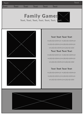
Designing the webpage from my wireframe I used boxes of colour to seperate my Text and images. I decided to use the homes from the back of the cards next to the title as families and homes link together in my theme. In the text I have three main sections that is essential information to know they are separated by headings in the same blue used for headings on the other pages showing consistency along with the font Lato used in different ways.
I created another webpage that the user would be sent to if they added the card game to their basket. It offer them the opportunity to add a donation and tells them thank you. They page also shows a collage pattern of the cards which is fun and different to the other pages.
Within feedback of the webpage everyone felt like the main page fit well within the Dogs Trust existing design however the extra page wasn't as consistent and harder to read.
In my second layout I added the bar to the bottom of the picture centralising the donation section so it draws the eyes and this layout is a lot easier to understand and use.
To show what the website would look like active I created it in Adobe Xd and created a clip.


