Monday, December 28, 2015

WayFinding Victoria Quarter

After my last critique I decided on a final plaque design taking into consideration what other people felt was most affective. I went with the slanted writing along a line which resembles a street. I made many plaques showing different sections of the quarter and these plaques would be placed in places that they would be most useful. I had to split County Arcade and Queen Victoria Street because they had the most shops.
In the last critique someone commented saying they liked that I had picked Bodoni as the font but said they think I should keep the plaques as all Bodoni and not include the sans serif font. I tried this but felt my original design choice was stronger because it was easier to read in smaller size and looks more professional due to the readability and modern look.

To show what the plaque would look like in context I took a photograph of one of the marble walls in the quarter and put my design onto it.
I stuck with my original designs for the shop fronts. Because I received good feedback.


I also stuck with the map because people respoded positively to it saying it was easy to follow. However I decided against the leaflet design because it was to over crowded as
not fitting with the classy nature of the rest
of the designs.


Public Information Video


Lonely Water
Lonely Water was a public information video made in 1973 for the Central Office for Information.
The message of the video is to warn children of the dangers of water. It shows that you should not play in around water or act carelessly. It encourages children not to swim in water without a parents permission and not to play around water alone. The key facts shown in the video is that children do not think about the consequences of being careless around water. The tone of voice is very dark and morbid due to the fact that the speaker in the video is Death/ The grim reaper. The Audience of this video would have been children who were aloud out to play alone around the age of 7-12 years. This was a successful video as it was memorable and made children of the time take notice and not play around water.

Olympic Symbol

After My last critique I decided not to use a figure within my designs and to look more into the markings that are made in the ice in figure skating.
I started by looking at what shapes I thought looked the best.


 I liked the idea of a loop as that was a well known ice skating move. I also decided to make it more clear that it is iceskating I should add the silhouette of an figure skate boot.
One of my favourite ideas was that the marking would look like an S which stands for skate.


I was also told in the critique that I should see if I could get a different winter sport to fit into my design style and to see if it would still work well. I tried to create Skiing by having the object as 
an mountain and having a trail marking that would resemble the marking that ski's would make
in the snow.

Friday, December 18, 2015

Typesetting

When looking at typesetting there is many things to consider. You can create a modernist design by using grids, margins and columns. You would think carefully about type size and alinement. You would not want to create orphans, widows and rivers and the purpose is to make the text easy to read.
However postmodernist design goes against the rules of modernist typesetting. The text does not need to be legible, the text is used to express a feeling or story.

I looked at typesetting The Mouse's Tale by Lewis Carroll. My modernist design follows the rules od modernism and is easy to read as a story. Where as my postmodernist design is shaped to look like a mouses tail and is more fun rather than legible as a story.


Way Finding Critique

For my critique on my way finding I was in a group and I presented my ideas using a presentation. I got some useful feedback that would help me to adapt and finalise my ideas

My inital Ideas were to change the font to something that is more readable and relevant. I did some research and came to the conclusion of using Bodoni. This is because it is an old font that was used for high end companies and was know as being classy and elegant and well and it was used a lot in fashion settings. I thought this was perfect for the Victoria Quarter because they want to portray class and elegance while keeping the history. I also wanted to change the colour scheme as I thought the gold was difficult to see. I came up with the idea of black and white because it has an old fashioned feel that is also high class and bold. Also when looking into the logos of some of the shops I noticed a lot of the logos and signs are black and white or work well in monochrome.

 When I visited the Victoria Quarter I saw that there were some plaques on the walls that talked about the history of the place. I decided to experiment with having parts of a map on a plaque on different walls around the quarter. I wanted to keep it a simplistic design because it would be carved into the plaque. I started by using a Simple line and ordering the shops but I think it looked cluttered.
 My second design was to slant the shops which I think is more successful because you can differentiate between the shop names better. Finally I thought of having a box structure that shows the order and rough size of the shops. I think this makes it look more modern but less simplistic.


I Also decided that a leaflet would be a good idea because people can walk around using them and take them away. I decided to put the logos of the main shops onto the map instead of doing every shop and making it to cluttered. I think this map is good for getting a general idea of where shops are.

I then used the Bodoni font on the original shape signage and applied my ideas to my photography of the quarter so I could see if it would work in the real setting. I believe it is more readable and effective than the current signage because it is easier to read from a distance.


This is some of the feedback I received:

  • Clean and clear. Good concept behind redesign. Monochrome scheme works well. Definitely lacking a map. Well considered design. Look at doing a stand alone map or similar.


  • Much more appropriate typeface choice, very classy & elegant. Choice of black & white works better, it has a better contrast. consider maybe backlit signs it could stand out more.

  • Colour scheme is good Monochrome makes it look very high class. Map is good simple and clear. Uses of the shop symbols are good as they are recognisable due to designer brands. Shapes are good to outline the building.

  • I like the map where the names of the shops are angled. Leaflet did look cluttered make the map the leaflet.

  • Like the more contrasted black and white, try silver, would be more classy but would stand out more than gold. Keep the maps consistent in the typeface Bodoni.

    To move on from this feedback I am going to experiment with using silver and decided on a final plaque and leaflet design.


Tuesday, December 8, 2015

Olympic Symbol Critique


I had a group critique for my figure skating symbol some of the comments included;

  • I should look at more markings on ice that could relate to different tricks
  • Try to experiment by including ice skate boots
  • try other winter sports to see if the same style will work.
We then did more detailed feedback for two other people.


Jen Feedback
  • Will be effective at smaller/larger scales yet the stroke of the snowflake could be too thin when smaller.
  • Colour could be less vibrant and more icy - such as pale pastel blue or even grey. Also make sure it is understandable in black and white I think it would be.
  • Try the style in a range of winter sports before considering the production method. Having the ice-skate boot pointing down with a spiral coming off it could also be really effective 

Nicky Feedback
The design remain highly visible at small sizes, the stroke widths are sufficiently scaled. The symbol works in 
black and white, and the chosen blue is also suitable (Its informal by the fact that its a cold winter sport) The light blue provides just enough contrast to the white. however a darker blue would be even more appropriate in Bright light situations. The design would work ideally in both print and screen media, however it would benefit if the curves were made to be smoother. It could be easily applied via vinyl, projection, 3d, illuminates and printed. Good impact, great clarity and scales well. You do not need any snowflakes !! I like the person one best :) Try combine person and swirl.

I will take this feedback into consideration and make some changes to my symbols and do some more experimentation.

Thursday, December 3, 2015

Way-finding Research and Critique

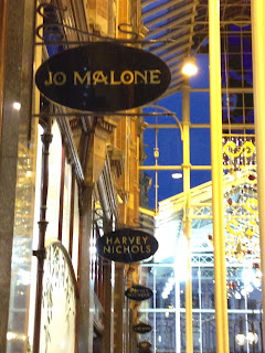
When deciding where to design way finding for I decided on the Victoria Quarter because it is the place I find hardest to look around due to the lack of signage. Also they have a theme of black and gold because they changed all of the shop fronts to the colours and changed them all to a certain font. I find this confusing because from a far it is hard to read the signs and because they have changed the colours you can not tell what the shop is from its known colours. There are no arrows or signs pointing you in a direction and there is a map but it is minimal and there are not many. When creating signs I want to keep the same feel of class and elegance and the history but add a few more signs to help people find there way better.

The Victoria Quarter consists of three blocks and was built around 1900. It was designed by architect Frank Matcham. The arcades are filled with mosaics and marble with glass roofs. It is situated between Briggate and Vicar Lane in the centre of Leeds.


In the critique I asked some people 3 questions.
Do you think the signage in the victorian quarter is successful?
Do you like the black and gold colour scheme?
Do you think the typography is successful? 
The feed back included
  • There is no signage to show where individual shops are.
  • I think the signage is posh and sleek which is necessary as it shows the type of shops.
  • The colour scheme suits the more classy shops but they are hard to read from far away.
  • I like the colours but it is hard to read from a distance.
  • The type suits the target audience but can be difficult to read from a distance.
A shopping Centre I like the signage for is The Metro Centre because they have split the areas up into colours and they have a clear map, they also have a lot of signage and pictograms. They call the different areas the Yellow, Blue, Green, Red and Platinum Mall. I think it is easier to have different names and split up the areas.


Folds

This week I looked into the sizes and the way publications can be folded. We were then told to produce a folded publication out of a A4 sheet of paper. I choose to create a folded fortune teller because it is a unique way to communicate information and it brings me back to my childhood. I then looked at different ways of creating a guide to show how to make these folds. I looked at photography of the folds step by step. I also hand drew a diagram where I included scissor symbols and arrows to show movements. I believe that It is affective for adults but not as easy for children to understand. I made a key to show what my signs meant if it was not clear enough.


This is a Time Laps of me creating the Folded Fortune Teller