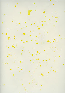
I looked at some book covers that I liked and thought about what aspects I could include in my book cover. I like the cut out and I also liked not having to much information and minimal colour. I wanted to include no more than three colours I thought of having blue and yellow as it could represent happy and sad. I thought If I had a small cut out it would make the book more playful and interactive. I played with the idea of using photography but then decided that I wanted the front cover to be creative using paint.
I messed around with splattering paint and drips using yellow and blue, I wanted to give the effect that your life is made up of happy and sad. I used photoshop to overlay the paint until it was how I liked it. I came up with the title Happiness is a choice because it is an indirect way of telling you that you can be a positive person but it also makes you want to find out more.

I made the second page of the book fit the front so that when I cut out the hole in the O it would match the smiley face on the second page. The second page represents that even if you are surrounded by sad people you can choose to be the positive and happy person.


No comments:
Post a Comment