Tuesday, January 31, 2017

Papyrus Brief

Papyrus is a national charity for the prevention of young suicide.
They are encouraging people to talk through the taboo. I have actually lost a close family member to suicide and I know that a lot of people find it diffiult to talk about the subject especially with me. I want to do this brief as I believe in the cause know it is important for people to deal with stress and mental health problems in a positive way.

The brief
To create a line drawing for a colouring in page.
You can be as literal or abstract as you like. The specifications are that it needs to be A3 landscape
with space for your paragraph, and please use a  0.3mm fine liner pen. If you prefer to work digitally, please use a 3px brush size. You can also take a video of a time lapse of you creating the drawing.

Initial Ideas 


My initial ideas is to have a pattern that represents that people are there for you as support and to be greatful for your friends and family. It should also show that there are lots of people who are in the world and you will not be the only one feeling stress or upset.

Drawing some initial ideas I like the idea of using hands or people shapes. I want to include detail patterns that are fun but easy to colour in. These patterns will go in stripes across the page but will alternate on the outlines. I will create some mock ups first.


Papyrus Research


Before I create some initial Sketches I want to look at Papyrus as a Company and what they are trying to achieve. It is aimed for Young adults who are thinking about suicide and it aims and helping people to deal with issues such as stress. When looking at the website it encourages people to talk which seems a main thing they are trying to achieve. Therefore within my design I want to encourage people to talk to one another.

Wednesday, January 25, 2017

Creating posters and Critiques

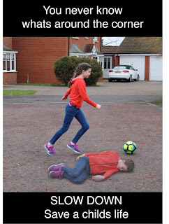
 I began by creating a poster that showed a young girl playing in the street but also the body of the young girl on the ground showing her as if she'd been hit by a car. I added the text, you never know whats around the corner as the main message along with the demand Slow Down. I like that the girl looks vibrant and playful against the black blocks of text.
I also created a poster that focuses on the Childs reaction when she sees a car coming fast towards her. I included the colour red against the black and white as red connotes danger and blood. I again included my main message and the demand to slow down.


Both poster ideas work for the message I am trying to portray but they don't feel finished in a sense. Therefore I decided to have a group critique showing what I have created so far. 
I asked the following questions and these were my responses.

Can you see the issue I am trying to portray?

  • Yes, Due to the images that have been used I can see it is about children
  • Yes, due to the shocked face and what is written

What would encourage you to slow down when driving within a campaign poster?

  • Shock tactics, that make you realise what can actually happen
  • Photography that shocks you as people are usually more visual and will look at the image before the text.
  • Colours and images that stand out and get me to look at the poster in the first place.

Other Comments?

  • I prefer the poster with the girl playing as it is clearer to me that it is related to driving.
  • The shocked face poster is not noticeable that the image behind her is tyres.
  • Maybe put the girl on a busier road, as it looks less likely that the girl will be run over.
  • Change the tyres to a more impact image. Maybe a road?
To carry on I need to further develop my posters and have more discussions with people on what is the most effect.

Saturday, January 21, 2017

Collecting Photography

Going forward with the idea of road Safety a thing that I find most annoyed me and my family is People driving to fast around streets of houses. So I want to focus on creating a poster to stop people from going fast in areas where families live. I want to go with the idea of you never know what is going to be around that corner so you should be slow.
I took some photographs of 10 year old Maddie playing football on the road in her street. I then took some photographs of her lying on the floor suggesting she had been knocked down. I also asked her what she would do if she saw a car coming fast towards her and she screamed. She knows that cars are dangerous but she thinks playing in her small street is fine because if she sees a car coming she can run onto the path. However if a car is going to fast around that corner she could be ran over. There are over sometimes over 10 children play on the road in daddies street. This is something that I want road users to be aware of.


I also took some photographs of car tracks and wheels, things on a car that have texture and could be used within my design.


Thursday, January 19, 2017

Shy Bairns Get Nowt - Brief

A Zine I took interest in was Shy Bairns created by another Graphic Designer Erin. After seeing her call for submissions and me living in the North decided to put my take on the project and enter.

I started by thinking what do I think of when I think of Home in the North and I immediately thought of family. Me and my family are from small towns that are next to each other called Houghton-le-spring and Hetton-le-hole and are located between Sunderland and Durham. My Grandar is a person who I admire and reminds me a lot of the north by his everyday routine and how he talks passionately about the history of mining and his hobbies. I am planning to do a photography piece including my Grandar next time I am home.

Primary Research

I began researching some existing card collections by going out into card shops and seeing what caught my eye.

 Going to scribbler there were designs that caught my eye. as I am creating music theme cards I looked more at cards in that theme. I liked this card as it relates to David bowie indirectly and shows an animal that many people love.
 Looking at bags they are usually made up of a pattern which relates to the collection. Maybe I could take images from my cards and make them into a pattern to go onto the bags and wrapping paper.
 I like when collections have similar layout, styles and typography that draws them together. These cards also have a comedy to them.
These cards are a good style but I like cards that are more ambiguous.


This collection stood out to me because of its simple and playful line drawings and how the envelopes are all the same style which brings them together as a collection.

Tuesday, January 17, 2017

Initial Ideas Road Safety Poster

When creating some initial ideas I wanted to create something that had a high impact. I want the theme of my posters to be about the death of people or children when you do not drive safely. I want to create some road scenes using photography, have some portraits of children faces in shock and look more at getting people to think about there actions. To carry on from my idea generation I will have a photoshoot and then look at what I think are the most impactful images

Final Penguin Submission


Overall I was very happy with my outcome and felt it was a unique cover with a strong theme and meaning. I think that it will stand out from other submissions due to its simplicity and use of texture and colour. I really enjoyed doing this brief as I am interested in book design and I like the ‘To Kill a Mockingbird’ story. I wish to do this competition again next year.


edmkmks

Research Road Safety


 There are many car safety charities out there working towards saving lives. Looking at some of the popular ones they all have many campaigns about different types of road safety from Motorbikes to seat belts. They all work towards educating people on the rules of the roads. They use media such as websites, videos and posters to put there ideas across.


Think! is one of the big companies that is well known in the uk for Road safety. They have a large target audience and there Moto is Stop. Think. Live.
Think! has many campaigns and they have a well made website where you can read facts, advice and watch videos, listen to adverts and Download and print posters. When looking at Think! posters they have many different styles but they mainly like to Shock the audience into spending there time looking at the poster and getting the message into their heads. There logo is made up of bright yellow which stands out and there information is clear and easy to understand. My favourite of the posters are the photography based as they look more realistic and can give the audience a better understanding of what can really happen. When moving forward with this project it is important to think of ideas that will have a large target audience and will work well as an international poster. I want to create something that will shock the audience and help them to see that driving is serious and will not only effect people in cars but people walking by.


Grafers international Poster Competition

When looking for small design competitions I would be interested in I came across a website called graphic competitions.com On that website I found a international poster competition for Cyprus international university.

The competition is asking you to create a poster that aims to raise awareness for road safety. This is a competition is in honour of Ali Garginsu, who passed away in a motorbike accident in 2014. The competition is open to anyone and is free to enter. If you win your work gets two honourable mentions and is featured in an exhibition. This competition stood out to me because it is asking for your design to make an impact and communicate an important cause. I also enjoy poster making and looking at various campaigns.


When looking at the aims and why I should make the poster the points that stood out to me is that I need to show the significance of Graphic Design to solve serious social problems.


Friday, January 13, 2017

More Sketches

After creating some more detailed sketched I will need to decide on which I think are more effective to create. I will then need to digitally produced some (more than 4) and then narrow them down to 4 by asking people which they think works well.
Ideas


  • Arctic Monkey - Knee Socks - Have a monkey in the snow wearing knee high socks
  • Blur - Girls and Boys - A girl and a boy in love blurry
  • The Kooks - Bad Habit - A blue heart (linked to alum cover) in a frying pan being cooked
  • The Kooks - Seaside - To chefs/cooks on a beach


  • Oasis - Half the world away - Half of a world in space
  • The Libertines - Dont look back into the sun - Some big eyes with a sun behind them
  • Arcade Fire - The Suburbs - A Arcade machine on fire with a city scape on the screen
  • The Smiths - There is a light that never goes out - A bulb and the wire inside says 24/7


  • The Wombats - Lets dance to joy division - two wombats dancing to music
  • The Strokes - Last Nite - A moon on the sky with a light switch on
  • Pearl Jam - Even Flow - A jam jar with a pearl on the front
  • The white Stripes - 7 Nation army - black and white stripes with red army men on


Researching online cards

I began my online research by looking around the UK Greeting card website. I wanted to get an idea of what styles they have and what there aims are.
They have many products for different companies all with different style and aims. For example the Thinking of you cards have the slogan 'Great Quality, Great Value' and Hanson White is 'The Home of Humour'. When i create my card collection name I can think of a short message that will represent my theme well. They talk about cards as having a large mix of designs with different aims and the saw this and thought of you moments. They are very open to you sending them card designs and submissions. Due to there being a mix of photography, illustration and type cards it is safe to say that any type of style I try will fir with there company well.

Looking at other card websites such as Hallmark when looking for a card based on music you can buy cards that play little tunes when you open them and there are cards with instruments etc on them however there are no cards like my idea that include lyrics and link to a certain genre of song. When looking specifically for song lyric cards I found that you get put onto sites that personalise the cards for you which can e good but also more expensive and this means you have to plan far ahead.


Looking at gift bags and wrap the more simple the design the better. It is also better to not include words because then it will relate to more occasions. The repeat pattern is what is used for wrapping paper and I will need to create something that works well over and over again and can e used for oth men and women of a verity of ages.


Group Critique, Jan 12th

I had a group critique on responsive work. I decided to use the time to discuss my idea for the UK Greetings.
This is what I talk about;

Main Idea 

Create a collection of cards which is based on Indie Rock music. Make the cards illustrate a song or a band and that keeps the fans guessing and is ambiguous. Include appropraite lyrics within the design.
I made a note of what I need to create.

  • 4x single greeting cards (with envelope design)
  • 1x Notepad cover
  • 1x Boxed notecard set
  • 1x Gift bag
  • 1x Repeating pattern wrapping paper
  • Design sheet
I also showed some initial card cover I had made.

I asked there overall opinions


Feedback

  • I should try and explore the more grunge feel make it look rough and ready like that style.
  • I could try the collage style.
  • Make patterns for the note books inspired by lyrics
  • Have it square like a record or cd.
  • You could make it so people want to keep them to collect or use as posters.
  • It can e difficult to make the cards turn into wrapping paper and stationary. Think about how I can bring it all together and make that work.
Overall I got positive reactions and everyone seemed to like the idea to carry on I can look at the idea of making the cards look more in a style of indie rock bars etc and how I will create the other stationary. I also need to consider that the judges will first look at the images before the reasoning behind the design so I need to make it clear what the idea is. 

Initial Sketches

Now knowing my theme and idea I began to create some initial sketches. I looked at some popular indie rock bands and lyrics that could possibly work for a card. I want my cards to be able to be used for any occasion and have fun and lively illustrations. The idea is the card should be ambiguous and not at first obvious what it is until you work it out. Only fans will understand some of these cards. Next I will have to have a group critique about my ideas so I know wether to further develop my ideas.

Tuesday, January 10, 2017

Researching music


When researching music I looked at famous artists in the Indie and Rock genre. Next I will look at there most well known songs that I can't turn into a card design. When creating my cards I will look at their album art and music videos to help me with the design. I want my cards to get people guessing what the song and band is by not making it to obvious, this is so it has some hidden meanings for people who are fans of the music. An example is illustrating the bands name or the song in an ambiguous way. This is different to what I have seen in music themed cards and will help my designs stand out.

Friday, January 6, 2017

Evaluating Bookshelf

Evaluation
I started this brief by identifying a problem. This was that there are not any interfaces that support social interaction to do with reading books and what is out there is not as effective as it could be at encouraging reading and iteraction. Looking at creating an interface I wanted to create something free for the audience and use a screen based design that was easy for all ages to use. I started with many ideas however after numerous group discussions decided on creating an app which is like a social media platform. The potentials of this was that individuals would be able to talk to other book lovers and would be encouraged to write reviews plus more book related things. The limitations was that being an app the audience would need to own a smart phone also the app could be free if there was a potential of the app being supported by big book brands such as Waterstones and Foyles. Thinking about style and colours I wanted my app to be a relaxing and calm atmosphere by the use of more neutral colours. However in my group discussions it was made clear that the app needed to have some form of personalisation to category to the large target audience. I also made sure that the writing was readable the the navigation was understandable and easy to use through navigation tests. I carried out research of looking at competitors such as good reads and knowing is a problem by creating surveys. when moving into the production stage I decided that adobe Xd was the correct program to use due to the way you can navigate around and create videos of the app or interface working. Taking all of my research and feedback into consideration I produced the app appropriately showing a working prototype. I also created a small advert to show the apps potential and showing the range of audience. Overall this brief was like nothing I have done before being all digital and screen based. I was able to learn how important user experience is within screen based design and how to use a platform such as adobe Xd to create a prototype. I think my app is successful at making the experience of writing and reading book reviews easier as well as being able to organise reading lists talk to other people and gain knowledge.


Thursday, January 5, 2017

Choosing An idea, Greeting cards

 After deciding that I am going to be creating some blank cards for any occasion I came up with two main ideas. Idea 1 having a theme of cards based of Pets. The second being a Theme of Music. Both subjects relate to large amount of people and is something that people love and are passionate about. They also leave room for many card ideas. After deliberating  decided that I would go down the path of music as I see a lot more animal themed cards already are out there and everybody likes music but not everybody has a pet.

I decided to start by brainstorming some music genres that could be possible. I need to decide wether to include many different genres mixed together in my collection or to focus on a certain type and have the other genres as potential to add to the collection if successful.


Wednesday, January 4, 2017

Creating an advert/Animation

Once I was finished creating the app I wanted to create a video that was like an advert but also showed how to navigate through the app. I began by creating some small story boards as initial ideas.

By using the adobe program XD I knew that I would be able to film the navigational part of the video using that however I also wanted to film my own parts to show more of the apps personality and make it look more professional. I wanted to show the board range of audience by including young and older book readers. I also wanted to show the app being used on a mobile device.
After watching some other app videos I saw the phone is usually placed on a plain background so all your attention is on watching the screen. Also at the end it sometimes tells the audince that the app is available from the App Store. From these initial ideas I began to film and edit using iMovie.
I picked a upbeat song and colours and put the video together I believe it represents the app well and you can see that the app can be easily navigated.


Watch the video here https://vimeo.com/198349872