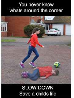
I also created a poster that focuses on the Childs reaction when she sees a car coming fast towards her. I included the colour red against the black and white as red connotes danger and blood. I again included my main message and the demand to slow down.
Both poster ideas work for the message I am trying to portray but they don't feel finished in a sense. Therefore I decided to have a group critique showing what I have created so far.
I asked the following questions and these were my responses.
Can you see the issue I am trying to portray?
- Yes, Due to the images that have been used I can see it is about children
- Yes, due to the shocked face and what is written
What would encourage you to slow down when driving within a campaign poster?
- Shock tactics, that make you realise what can actually happen
- Photography that shocks you as people are usually more visual and will look at the image before the text.
- Colours and images that stand out and get me to look at the poster in the first place.
Other Comments?
- I prefer the poster with the girl playing as it is clearer to me that it is related to driving.
- The shocked face poster is not noticeable that the image behind her is tyres.
- Maybe put the girl on a busier road, as it looks less likely that the girl will be run over.
- Change the tyres to a more impact image. Maybe a road?
To carry on I need to further develop my posters and have more discussions with people on what is the most effect.


No comments:
Post a Comment