Friday, February 24, 2017

Distribution of materials

There are a few campaigns out there for suicide prevention. But how do they promote this and spread the word.

  • Posters put in public places to be seen by big crowds.
  • Social Media Campaigns - Hashtags 
  • Leaflets
  • Websites
  • Downloadable content PNGs
  • Videos.


A good example of distribution is the We Listen Campaign designed by MullenLowe London. The piece is made for the Samaritans and is funded by the National Rail. This means that the posters are distributed in train stations were the main target audience can see it. I saw these posters when I was on the train at station we stopped at and they made me want to find out more about them and the cause. I also saw them in the Beazleys design of the year exhibition at The Design Museum as they won awards for their design.


Suicide Taboos

Why is Suicide such a Taboo

It is apart of history that suicide is considered one of the worst sins a human can commit. However it is now linked with mental health problems. People find it difficult to talk about the subject of suicide due to this stigma. When someone is lost to suicide people try not to approach the subject in case it brings shame to the family and friends of the person. Even though we are more educated now it is still seen as a weakness.

This taboo needs to be broken talking about suicide and bereavement needs to happen so that it becomes more of a normal and not an embarrassing topic. This can lead to people being more open to talk about their opinions and feelings on the matter.

People who have lost someone feel it increasingly difficult to talk about there feelings as they feel that people do not understand how they feel.
Websites such as Alliance of Hope Community is dedicated to having forums of people who have gone though a loss in this way to be able to give advice and talk to each other. This is very important as people should always feel like they have someone to talk to who understands them.

There are some scary statistics out there, As people are taking there lives in there midlives many children lose a parent. 
Article - http://www.hopkinsmedicine.org/news/media/releases/children_who_lose_a_parent_to_suicide_more_likely_to_die_the_same_way

  • Losing a parent to suicide at an early age emerges as a catalyst for suicide and psychiatric disorders.
  • Those who lost a parent to suicide as children or teens were three times more likely to commit suicide than children and teenagers with living parents.


Wednesday, February 22, 2017

The issue of Male stereotype and pressures.


Why is it that there are so many male suicides in Britain?


Researching I found that a very talked about subject is the social issue of stereotypes of gender and the pressures of living.

Society is putting pressures on men by telling them how they should act, look and feel.
Men feel like they need to be strong which leads them to feel like they cannot share when they are struggling. The highest age range for Male suicide is mid-life. This is when men are stereotypically supposed to have a family and a secure job which makes people who do not fit into this lifestyle feel like they are failing. The media have been doing things to try and tackle this stereotype however it is still an issue.

This video is called Boys Do Cry and was made to show that it is okay for men to have emotions and share there feelings.
https://www.youtube.com/watch?v=3GZEmGb-MR8
A video by Buzzfeed on the same topic
https://www.youtube.com/watch?v=O_2YWTG9Rug

Stereotypes
Masculinity - Men feel like they need to have certain roles, traits and behaviour.
Mid-life - midlife years are a prime part of life. Men should be in the best part of their life, they should have a family that they are providing for with there successful job.


Researching - Charities

As Male suicide is a issue that is increasing there are many charities and campaigns out there that is working towards helping the issue.

Calm (Campaign Against Living Miserably)


Calm is a charity dedicated to preventing male suicide. They are based in London and are working on doing things such as; offering support, Changing a culture, Pushing for changes in policy and practice and supporting those bereaved by suicide. 

Calm raise awareness through a number of ways such as creating a lifestyle zine for men sold in Topman around the country. They fundraise money and hold events. They also show themselves through social media by creating hashtags. They have a help line and a good website that you can find news and information


Samaritans


Every six seconds somebody contacts samaritans. They are there to talk to people no matter what the time. They have over 200 branches in the UK and have over 20,000 volunteers. 
They are there to be a person who listens to you. They are not just there for people who feel suicidal but anyone who needs to talk. 

They have statistics and research on suicide rates and they rely on donations and volunteers. You can visit the website, call, write, visit or email them and everything is completely confidential. The  raise awareness through the Media, graphic design and by going out to places to talk about the issue. There main aim is to save lives 


TASC (The Alliance of Suicide Prevention Charities)


TASC is a charity that deals with mental health and suicide and is a education and resource hub. They have World suicide prevention day. They give you links to websites and booklets that can be helpful. They also do a lot of research.


These Charities are trying to improve the issue and work towards the same goal of saving lives. They are good to look at statistics and can help me when I identify what I will be creating.


Tuesday, February 21, 2017

FEEDBACK // Initial Ideas for Leeds Event Poster

Today we got into pairs to discuss out ideas for the Leeds event posters. I was paired with Sammy and he gave me some good ideas to consider.

I talked through my initial event research of  the train station and Suffragettes. However I discussed my favourite event finding which was the Leeds Clothing strike. He also agreed that it was a fun way of incorporating material in my designs. 

We discussed the ideas of how to make a poster that will stand out at the exhibition using traditional and handmade methods. We also talked about creating a poster that is created in a  feminine way and contradicts whats being said. 

I am going to research into fashion in the 1970s and protest posters. I also can look at different materials and stitching methods that could be used.

Monday, February 20, 2017

Creating Stickers - UK greetings

After identifying that my envelopes for my main cards were going to be made out of clear cellophane I knew I had to create some stickers so that there was a way of writing a name and address on the card. I created some initial sketches of how the sticker could be made to fit the music theme.


I digitally created some of the stickers and decided to have a discussion with another designer about which was the most effective. We agreed that the design needed to be made simple so that the address and name that the person will write on would be readable. I wanted to include my collection logo to keep the sticker as part of the group and make it more exciting then it just being plain. The two stickers that were deemed best were the white with black logo and the grey with faded logo I will pick and print one of those designs.


Saturday, February 18, 2017

Mock ups - Uk greetings

I want to make physical prototypes for my UK greeting products so that I can photograph and present them in a professional way. This means I will have to create a box and a bag.
Creating the mockups took some trial and error to get the sizing to fit the guidelines. but after creating the box and the bag I feel better prepared to design and create them for the photographs.


Boxed notecard development

I decided to ask a few music lovers what they think would be best for my boxed cards designs. If I should focus on type or image. However most people said that they would like to see a mix of both in the box and have at least 4 different designs to be able to choose from. They like the idea of having type and image separate but it was agreed that the cards should not be for any certain occasion. I then did some sketches.


I have the idea of 3 different type cards and many images. After looking at what I think would be best I am deffinitly going to go with You Rock to keep with the theme but I will also consider other text. I will further develop my  ideas

Friday, February 17, 2017

Bear group session 3

Getting together we talked about what we had done while we were apart. My other group members did not get as much research done as anticipated therefore we needed to look more info there fairytales together in the session. I showed my layouts to the group and they liked it as a starting point and the ideas to have two facts, a narrative that shares a small amount about the story and gets the children hooked and a joke or a quote.


We spent the session creating a mind map which included what we wanted on each card which included facts, images ect. After decided on all of the stories I brought forward the point of if we could realistically create all of these cards before the deadline. We all agreed that we can show all of these ideas however it would be best to focus on a smaller amount so we can put in our best efforts in quality rather than quality. We decided to focus on our most strong and fun stories which are Little Red Riding Hood, Jack and the Beanstalk and The Princess and the Pea. 

I showed them my initial idea for logos and they preferred the open book. Louis like the narrative of bear going to the library and reading a book then he falls asleep and in his dreams he becomes part of the story. I really loved this concept as it is fun and links to the idea of encouraging children to read.

We decided to meet with each other Thursday the 23rd which gives us 6 days. Louis will be concentrating on the narratives and some sketches. I will focus on Layouts, Typography, Colour and getting feedback. Penny will concentrate on sketches.


Thursday, February 16, 2017

Researching and collecting for Bear.

I decided to create a google slides document for the group to be able to share there findings when we are not together. This way we can see what facts and information each other are getting and we can communicate better as a team.
On the slides I added our To do List and encouraged my group to keeping looking and adding on the slides.

I began by collecting information on my three fairy tales which were; The Three Little Pigs, Hansel and Gretel and The Princess and the Pea. I also try to think about how we could incorporate bear into these stories.


With layout I like the idea of having a main image on the front showing bear in the story and having the only text being the logo and the name of the fairy tale. The other side could include the number of the card. The narrative, facts and small images. I also thought a little bit about the logo design which could be either a open book or some fairy wings. When looking at colours I think the cards should be bright and fun and the text should be easy to read for younger children.

I will be meeting with my group soon and my aim is for us to have detailed plans of what images and information we will put on each card.


Picking a theme and development Bear

I met up with my group again to discuss our development and with an aim to pick a final theme for our cards.
I talked through the idea for the culture cards and my layout and other ideas. The other two liked the idea but after looking more into the history of Bear cards we found that they already have bear travelling the world and it would be two similar. So we moved forward with another theme of fairy tales. We had some dicussion of possible layouts and together decided we are going to try and create 9 cards and the brief stated we needed a minimum of 3 and there are 3 of use so we should be able to create 9. We decided on each researching 3 fairy tales each.


Our cards are going to be humours and include bear as characters in the story weather that is making bear into little red riding hood or dressing him as a ugly ducking. As facts are a important part of the cards we want to have fun facts that link to the stories in interesting ways such as having facts about peas, for the princess and the pea story. 


The cards will only cover small amount of the story which should leave children wanting to find out more and encouraging them to get into reading which is important to start at an early age.
Together as a group we cam up with the idea of creating stickers that could with the cards and when you collect a cerain number of bear codes you can get an empty story book which only includes backgrounds, with the stickers you have collected of the characters you can add them to the book to create your own story.

Once we were happy with our ideas we decided that we would each research 3 fairytales, collect facts, do some layouts and sketches and also think about our card collection logo which we think we will name Beary Tales. 


Boxed notecard set ideas

 I need to create a boxed notecard set. I don't want the cards to be the name design as my other cards so I need to think about a different idea for them. My original Idea was to either focus on type or image rather then both. I am also not sure weather to change to other songs or to go along with my theme of words that can be for any occasions. I will need to have a group dissussion to move my ideas forward.

Final Card designs

I created my final designs with the theme of making it look like a vinyl record as well as having a guessing game included. By giving the backgrounds a texture it makes the images and text stand out and fits well into my theme. The inside of the cards include a image of a record and the following lyrics that link to the front. The back shows the collections name and logo and reveals the song title and artist. Overall I am happy with my four main card designs and now I will create the rest of my collection based on these ideas and designs.


Submitting My Poster to Competition


After getting feedback for my two posters the one that seemed to be most popular was my second poster due to its shock factors and the fact that it is eye catching. You do not see many posters including children in this way therefore I hope by seeing this poster people will be encouraged to think about who are on the roads other than cars.

I submitted the poster and received this email in return.


You Rock - UK Greetings

After knowing I need a more general image that fits to lots of occastions I decided on the term 'You Rock' as it fits with the theme and is general. I decided the image should be a Rock hand sign as that is most commonly occasioned with rock. 


I made the image in the same style as the cards and this design will be put onto my boxed notecards, bag and note pad.


Wednesday, February 15, 2017

Wrapping Paper - Uk Greetings

Initially when thinking about wrapping paper I wanted to create a repeat pattern that included the illustrations I had done. I came up the the idea of having two card designs mixed together. However after creating the pattern and showing it to other people we all agreed that the paper would be to fussy and without its text would not be as obvious to what the illustrations meant. 
I then came up with a more simple but I think a more effective wrapping paper idea. I think taking the textures I took for the cards and having them as the wrapping paper will be a lot better than having it cluttered with image and text as I think it still fits the grunge indie feel while using it as wrap you can add a tag or a ribbon to make it pop.


Collecting Textures and Letters

After finding that my card backgrounds looked best with a textures I decided to collect some photography of surfaces I think would work well. I would make the textures darker  and I will only use the four I think are best.


I also collected more of the alphabet so I could carry on with my cut out style typography. And I purchased some label tape and made the labels for the inside of the cards. After creating the type I scanned them in and edited them onto the card designs.


Tuesday, February 14, 2017

My Research Poster Topic

After looking at a few areas I could do my poster based upon I decided to look more at The Leeds Clothing Strike in 1970. This was a important event that happened in Leeds and some impact on the thoughts on feminism and making women be herd.

Leeds Clothing Strike

  •  A quarter of all working people in Leeds worked making clothes, and half the working women
  • The workers were also among the most divided, with ‘skilled’ and ‘unskilled’ used euphemistically in place of male and female. 
  • The national pay agreement of 1969, between the National Union of Tailors and Garment Workers and the Clothing Manufacturers’ Federation, brought decades of unfairness on to the streets. 
  • Women were paid far less than men
  • The Women continued to march and encourage other women to join 
  • Pride in the industry that made Leeds famous
  • The strike lasted two weeks; negotiations — “Not bitter, but they were tough” — lasted two more. The workers got the increase they’d demanded and the industry began to move towards equal pay and parity with other industries.

 I found an interesting article explaining more about the event. http://www.thecitytalking.com/leeds-clothing-strike-1970/


I want to create a poster that shows the fight that occurred for equality and the impact they made on the streets at that time. I want to use traditional print methods and something that relates to the clothing industry. I want the poster to be clear and effective.

History of Leeds - Poster idea Research

I am starting this project by researching some past Leeds Event and People and looking at what I find most interesting to learn more about.

Leeds Railway Station

  • Railways arrived in 1834
  • It was extended to a more centrally-located terminus at Wellington Street in 1846, known as Wellington Station.
  • In 1869 New Station opened as a joint enterprise by the LNWR and the North Eastern Railway. 
  • The first rationalisation occurred in 1938, when two railway stations (New and Wellington) were combined to form Leeds City Station, opening on 2 May that year. This was designed by LMS architect William Henry Hamlyn. The third railway station, Leeds Central, was unaffected by the change. Part of Wellington railway station later became a parcels depot. The north concourse and the Queens Hotel were built at this time.

    This was an important time in Leeds as it Brought jobs and allowed travel to other areas.


Leeds Blitz

  • Air raids on the city of Leeds which took place on the night of 14th and 15th Of March 1941.
  • The Leeds Blitz comprised nine air raids on the city of Leeds. The raid affected the city centreBeeston, Bramley and Armley.
  • The bombing of the city's museum resulted in the losses of historic civic possessions


Leeds Suffragettes

  • Leonora Cohen - Leeds Born Activist
  • 1913 She removed an iron bar from her coat and threw it at a glass showcase containing insignia of the Order of Merit in the tower of London 
  • Wrapped around the bar was a piece of paper stating: "This is my protest against the Government's treachery to the working women of Great Britain."


Wavaw 

  • In 1980 Women Against Violence Against Women was established in Leeds. 
  • Driven by the Yorkshire ripper

Leeds Clothing Strike 1970

  • A strike by Leeds women clothing workers was initiated after the union accepted a low wage rise that discriminated against women. 


Leeds Coat of Arms


Further brainstorms

After creating my card designs I looked at what other things I needed to create for the collection and how I can design them to link to the cards.

When brainstorming ideas for the box card set I want to create the box and 4 cards that are more simple than my other designs. But includes similar textures and songs.


Looking at gift wrap and Bags I also want the design to be more simple and create something that can be used for any occasion. I would like the notepad to link to the collection name and typography. Next I will do some initial design ideas digitally.


Collection Name and creation


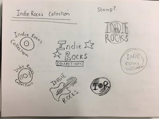
When naming my collection I knew I wanted a name that included the genre informed by my earlier research. I began doing initial sketches thinking of simple images I could include to my collection logo. I was looking at drawings of records but also the idea of having the logo look like a sticker that is used on a actual label. I could also think about making it look like a record label company. I then created some digital ideas till I was happy with a final logo.


After developing my ideas I created a Collection name and logo that fits my theme well. I used easy to read but unique typography and made it into a circle to make it look like a sticker or record label. This collection logo can go on the back of cards and other designs.


Record Shop Research

I decided that as my idea has developed into album covers I should go and do some research by looking at how actual records are kept. I went to a record shop in town and looked at the displays and covers. I found that all of the covers were kept in clear plastic cover to keep them in clean. This gave me the idea of maybe having my envelopes in a similar material to make it look more like a record. They also had different stickers on showing price and other information. As a clear envelope isn't a very practical idea for people to write on I could make a sticker that can go on the card which can be wrote on. I think when I begin to create the collection name it should link with the genre as that is how the records are organised in the shops by genre.


Typography Feedback


After trying these three typefaces that I feel works well I decided to show people the images and ask which they liked the best. Most people said they preferred the cutout style as it fits the theme well and feels very DIY. It also resembles some bands typography. However some people like the labels as well for the same punk, DIY feel, maybe I could mix the type between the inside and the outside.