Monday, November 30, 2015

Olympic Symbols

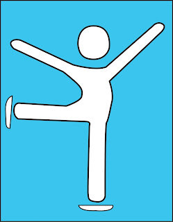
For this study task I had to create a symbol using only shape and colour for a olympic sporting event that I could choose myself. First I looked at previous olympic pictograms and these were my favourite. I like the curves and more simplistic designs. I would like to experiment with both symbols including a person and without.

The sport I decided to design for was figure skating because It used to be a hobby of mine. I started by looking at figure skaters movements and positions and drawing them in a stick man form to see which is most successful. I drew the body using curves and separately drawing the head and skates. I creating it using a grid and on illustrator. When looking at the colours I choose to do blue because it has connotations of cold and ice which is part of the sport. 


Everybody that I asked knew that the symbol was for figure skating due to the pose and skates.


I also experimented with looking at Snowflakes as it links to the winter olympics however as a symbol it does not reflect figure skating but all winter sports. I then looked at doing a more simplistic design my inspiration was the marks that Ice skates make on fresh ice. I thought this Symbol looked elegant due to the curves and changes of weight in the strokes and well resembles the elegant sport.

Friday, November 27, 2015

Letterpress

 This week I have had an induction into letterpress, I have never done letterpress or considered looking at it in a project until now. I have been letter pressing throughout the week using different methods. First I pressed a quote using black ink on white paper it took me a few attempts to get the paper lined up and I found it challenging to get the bracket tight so that it doesn't fall out but over time I got better. I then decided to create christmas cards on many red and green paper, I created a card that says 'hope you have a merry christmas' and 'This card is handmade because I have no money' Practicing has made me find letterpress easier and more fun I would now consider using it in my projects as a production method and I feel confident using the equipment and creating typography.


Wayfinding Research

I started this brief by doing research into signs around Leeds looking at common themes and trying to determine weather signs are affective or not. I looked at road signs and systems paying attention to the font and symbols that Margaret Calvert and Jock Kinneir designed to be easy to read and understandable. 


Leeds train station was heavily signposted to make sure travellers knew where they were going. I think the signs work well because they are consistent in colour and stand out. The arrows work well to point you in the right direction and all of the symbols are understandable.


The Trinity shopping centre signage is not the most effective, they have colours for each floor and use basic signage and arrows however it is not clear to see exactly were shops are and there are not a lot of signs.


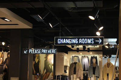
The signage in Topman and Topshop is not very consistent because it changes from being the neon light style to the light up white boards with black text. It is also difficult to find your way through Topman to get to Topshop. I still like the use of arrows and that the signs are up high so you can see where to go easily.

There are not very many signs at the Victorian Quarter, but it is consistent and fits well with the high class shops. The gold writing on the black background is hard to read from afar and there are no other signs to point you in the right direction. It can also be more confusing because to fit the theme they have changed all off the shops logos to the theme of black and gold so you can also not see what the shop is as easily from afar.
When creating signage I need to think about fonts and symbols but also the identity of my choosen place.

Wednesday, November 25, 2015

What is a book ?

What is a book ?
  • A written or printed work consisting of pages glued or sewn together along one side and bound in covers.
  • a bound set of blank sheets for writing in.
For me a book is not a kindle or a app but a physical object that you hold in your hands and turn the pages. A book is a form of communication, documentation and entertainment. The purpose of a book can be many things to teach someone, communicate something and to tell a story that is fact or fiction. A book is a collection of printed pages bound inside a cover and put onto a shelf. The digital age has changed the way we consume books but I want to look more into the real thing, not a kindle or a iPad but a book that you can smell and feel the paper.

Production
The earliest book to be made is dated back to 1300 B.C and was made from bamboo strips bound together with cord. Today things a done a little differently. Books are made from a variety of different types and sizes or paper and the cover of the books can be hard or soft. There are also many types of binding methods hardcover and perfect band are bindings used for more professionally made books were as smaller publications would be made with cheaper methods.
The design of a book all depends on what the purpose of the book is. You need to consider,
  • Page style and shape
  • Typography 
  • Use of colour
  • Layout 
The design of books has been changing even since the days of Johannes Gutenberg. Colour is important in book design because of its connotations, contrast and visual appeal it also has to be readable and work with images and typography. I think it is good to have a colour scheme when it comes to book design and not to complicate the design with to much colour.
A book I like the design of is Calm as the colours layout and typography all fits the theme of calm and are visually appealing to the eye.


Tuesday, November 17, 2015

Canon

Today I looked into canons which is Principles of page layout design used to measure and describe proportions, margins and print areas. It is basically the rules of graphic design when using grids and balance. I think proximity and the distance between the elements can be important depending on what type of publication you are creating. The same goes for consistency for example a newspaper needs a grid system, balance and consistency for it to be easy for the reader. I would use canon when creating
a publication such as this because the design has a clear meaning
and does its job well. However some types of canon I am not sure works such as the idea behind Fibonacci & Golden Ratio. It can be affective in certain design however it does not have to be used to create a good piece of graphic design. When creating my publication if I decide to make an informative piece of design I will use a type of canon to make it easier for the reader, however if I am creating something else I will not use canon in my design decisions. However I always think it is important to consider proximity/unity , alignment and repetition/consistency.

Sunday, November 15, 2015

Final typeface critique

Today we had a group critique on our final typefaces. we left our work out and some questions and let people look and write feedback, my questions were,

  • Do you think my typeface resembles the word hollow?
  • Do you think my typeface would work well within the horror genre?
  • Is it effective in both upper and lower case?
This is my final typeface design and my manifesto. I also put my design into context by putting it onto a movie poster and book advertisement. 


Hollow Oaks is a sans serif font originated from Garamond and made up of curved brackets and serifs inspired by the round curves of a tree. Its rugged bark texture gives its a spooky feel and works well in the horror genre. The font is best used as heading on posters and book covers as it is bold and intricate.


Feedback
I got a lot of mixed feedback on my work.
Peer feedback
  • It does have a spooky feel to it as it has a sketchy look and it works well in both upper and lower case but it looks best in uppercase.
  • Possibly could have made the lines skinnier to emphasise hollowness but is creepy and eerie as well as being readable and legible.
  • It does represent hollow and has a edgy, scary feel due to the jagged edges it is readable but wouldn't use in a body of text.
  • It feels hollow in two senses maybe the size of the outline could have been more consistent.
  • It looks hollow as you often think brittle and not stable like the strokes in the letterforms. I would associate the texture of the letters with horror.
  • I do not think that it represents horror as I thought this font could be used in children's books as it has a hand rendered feel which personally I don't think has an scary impact.
  • It resembles hollow as it is literally hollow. I like the link between the curves of the tree and font you could try elongating the letterforms to have a more 'towering over you' feeling.
  • The bark texture suggests hollow and is clear and consistent.
Tutor Feedback
  • A handwritten feel that works and would work for publishing and editorial, branding maybe
  • Keeps its heritage well from Garamond.
  • Manifesto, could be more considered by looking at your outcome and evaluating changes you made and why.
  • Good to see in context to reassure viewer.


Tuesday, November 10, 2015

Typeface design interim critique

On friday I had another interim critique for my typeface. I got some feedback on my ideas from my peers and tutor.
I talked about my initial ideas and how I wanted to incorporate the idea of a hollow tree. I also told them that my purpose was for the type to be used a a decorative font for horror posters and would be for print rather than digital.
I started with my first idea of thick weighted letters with nothing inside which shows hollowness but also have the lines look jagged and rough like the bark of a old tree. Then I talked about how I developed my idea by adding lines inside the text like the rings of a tree. I then looked at just having the thin lines and how it looked strange on the screen but when you print it out it looks better and more detailed as well as it would work on all scales however the smaller it is the more detail you lose. I wanted to find out which idea people liked better and thought best fitted my word of hollow and my purpose of a horror poster text.


Tree Bark Idea


Tree Rings Idea
Feedback
I got some constructive feedback on my ideas such as the tree bark idea was the closest idea to the word because it is hollow inside. My tutor said,
  • Excellent to identify usage and context
  • Good to build and extend concepts and look at how it works in print and digital
  • I need to be aware of the distinction between lettering and typeface design.
I realised that what I had shown of my tree bark idea was lettering as the o's and l's were different and I will need to work on making sure my font will work just as well as a typeface as some decretive fonts find it difficult to do. He also suggested I try making the weight of the font a bit smaller making it look more subtle so it could work better as a typeface. 

Figure/Ground

Today I looked at figure and ground and the differences between the two. We then looked at some magazines and examined them to look at figure and ground.

NME
The focal point of the cover is the name, this is shown by how it looks like it is sitting above the background and how it includes red. The black and white background gives the magazine a classy feel and the active white space draws attention to the figure of Sam Smith and utilises the space. The red connotes danger and relates to the theme that the magazine is trying to achieve which is that Sam Smith is like James Bond. A new feature to NME covers is the yellow circle which reads 'MUSIC FILM STYLE' this is used because the yellow stands out over the other colours and draws peoples attention to what the magazine is about. Inside the magazine their is a double page using the same techniques however using the background as a figure of a record and giving the image a larger white space to make the image stand out more.


Kerrang 

Kerrang has a more suffocating layout and does not have a lot of white space. The focal point of the cover is the image of the people this is due to the layering of the figures and size of the image. Inside there are a mix of colours of white space and you can see a grid has been used to help the layout look more organised. The colour scheme connotes the theme of the magazine which is rock and the plain backgrounds help the articles to be readable and not look to cluttered. 

VOGUE
Vogue magazine has a continuous layout that they stick to for the cover and a range of layouts inside. Many of there pages have large white spaces as this can show luxury which is what vogue aims to do when advertising high end fashion brands. However as well as having simplistic pages which aim to focus on the figure there are also more suffocating layouts such as the jewellery box page that have a white background but has lots of information and images crammed onto it.