I started this brief by doing research into signs around Leeds looking at common themes and trying to determine weather signs are affective or not. I looked at road signs and systems paying attention to the font and symbols that Margaret Calvert and Jock Kinneir designed to be easy to read and understandable.
Leeds train station was heavily signposted to make sure travellers knew where they were going. I think the signs work well because they are consistent in colour and stand out. The arrows work well to point you in the right direction and all of the symbols are understandable.

 The Trinity shopping centre signage is not the most effective, they have colours for each floor and use basic signage and arrows however it is not clear to see exactly were shops are and there are not a lot of signs.
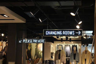
The signage in Topman and Topshop is not very consistent because it changes from being the neon light style to the light up white boards with black text. It is also difficult to find your way through Topman to get to Topshop. I still like the use of arrows and that the signs are up high so you can see where to go easily.
There are not very many signs at the Victorian Quarter, but it is consistent and fits well with the high class shops. The gold writing on the black background is hard to read from afar and there are no other signs to point you in the right direction. It can also be more confusing because to fit the theme they have changed all off the shops logos to the theme of black and gold so you can also not see what the shop is as easily from afar.
When creating signage I need to think about fonts and symbols but also the identity of my choosen place.


No comments:
Post a Comment