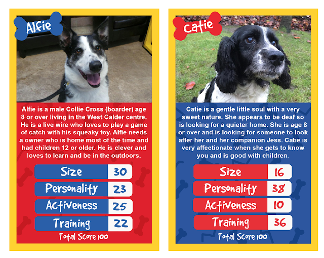
Looking at the two layouts I feel that it is best to use the Larger image and larger big box of text. It is easier to learn about the dog from a solid block of information rather than to have small amounts included in the game area. Also it is important to see the dog clearly as looks is a main factor that makes a person drawn to a dog.
I have two different colour combinations which is gender neutral for boy and girl dogs. Together in a pack of cards there would be these two variations along with 30 plus different dogs with their information.
Feedback
- You should try creating symbols for the categories to make it more engaging
- Colours are youthful and almost British
- However the colours can almost overpower the image
- Type needs to be more away from the edges
- Break it up more, its looking a little flat.
All of this feedback was useful as I found I could work with the contrast of photography and colour so I am going to experiment with some more layout.


No comments:
Post a Comment