Friday, October 30, 2015

Manifesto

Today we looked at a fonts manifesto. In groups we looked into the history of the fonts Garamond, Caslon, Baskerville, Bodoni, Clarendon, Berthold, Times, Helvetica, Univers and write them a manifesto. My group got Bodoni.

Bodoni
Bodoni designed by Giambattista Bodoni from 1740 to 1813. Taken from the word 'Drdone' meaning modern. This may seem strange now as it seems very traditional and ornate yet at the time was extremely modern the bold graphic consistency and the fact each letter works together and would be easily reproduced. The type was designed as a transitional form between Fournier and Baskerville. During the years the type was designed Italy was invading France and the country was in a period of transition the typeface feels Italian and could have been a statement of new times for italy. I think it is important to conci/der who could read at the time (not many) and the fact the church would have been the main source of  written literature for the country at the time. The high contrast in stroke weight is a recognisable feature of this type design and gives a grand and glamorous feel to the type. The typeface may have been designed for signage and for higher end companies given the large divide in class at the time Bodoni could have been a typographic tool to show a new modern and classy typeface for a company or business. The 'Vita nova da dante'  poem written in 1828 was a extremely popular italian poem of the time and was one of the first wide spread publications to print in Bodoni. The elegant and graphic and bold letterforms echoed italian design and set a bench mark for the future of Italian culture.

We also discussed our ideas for a our own fonts and gave each other some ideas and opinions. I have done a mind map for my adjective that my font is based on which is 'Hollow'. I did some research into different meanings the word has and different things hollow reminds me and other people of. When talking to people they liked the idea of the font having an empty space inside or experimenting with putting a tree into the type. I am thinking of calling my font Hollow Oaks

Idea for a Manifesto
Hollow Oaks is a sans serif font originated from Garamond and made up of gently curved brackets and serifs inspired by the round curves of a tree. Its spooky feel works well in the horror genre and is best used as headings on posters and book covers. The font works best in uppercase as it is intricate and bold.

Wednesday, October 28, 2015

Drawing the Detectives

On monday we were given the task to create a book cover design for an Agatha Christie novel as part of the Guardians celebration of what would have been the authors 125th birthday. We were encouraged to look at colour theory and typographic design. We picked a book title out of a bucket at random so that everyone would have something different. I picked 'The Moving Finger' a Miss Marple Mystery.
When doing some research into the book I found out that it was about a village that begins to receive anonymous letters accusing people of different crimes. I also looked into some already existing book covers for the moving finger and thought about colour theory.

My First Design
My initial idea was to included a letter on a dark wooden bench. I also wanted the letter to be faded so that the author and title would stand out. I knew I wanted to use the authors signature as it is a common theme on Agatha Christie novels. I also knew I wanted her name to be the largest text as she is very famous for writing mysteries. I choose a sans serif font to make the title appear serious and more old fashioned as the story was originally published in 1942. However I was not completely satisfied with my final design and decided I needed to further develop my ideas.

Final Design
I took some of the ideas from my initial design but developed them by adding a pointing finger as it links more to the title. I did this by taking a photograph of a hand and then drawing it with my graphics tablet. I also lowered the opacity of the letter so the text would stand out more. I did not like the brown desk idea so I decided to combine some colours that I think relate to the mystery book genre. I choose green because penguin made all of their mystery book covers green and I choose Dark blue because it reminds me of fog, shadows and all things mysterious. I also made Agatha Christie's signature red because it can relate to the story as there is romance and death.

I then uploaded my cover to the guardian website.
It then got published to the guardian page.


Tuesday, October 27, 2015

Colour Combinations

"There are no ugly colours; there are only ugly colours in combination."
                  Paula Scher 

Today we looked at some colour combinations, some complementary pairs are purple and yellow, red and green and Orange and blue. However we were given the task to choose our least favourite colour, I choose brown because when I think of brown I think dull, boring, dirty and other more negative connotations. We were then told we needed to use this colour and two other colours for the theme of a children's book.

My Idea for a children's book was to make it about a dog because children enjoy stories about animals and a brown colour could be the colour of the dogs fur. I also decided to pick the colours black and red.

Brown 464M
I choose this shade of brown because it was not too dark and it is more of a chocolatey, warm brown. That as a dog's fur could be more cuddly and inviting like a teddy bear and children my find this friendly.


Red 185M
I decided on red and it is both stereotypical to boys and girls and is a primary colour so it is one of the first colours children learn. I choose this shade because it is bright and colourful and will contrast against my other colour choices. I could also use this is a children's book for multiple objects related to a dog.

Black 000000
Finally I choose black because It is the best colour against the white pages for a child to be able to read. It could also be used as an outline for the illustrations.
An Example of what these colours could look like on a children's book cover.


Sunday, October 25, 2015

Final T.K.Maxx logotype Critique

On friday we had our final critique for our logotypes. We had to leave our work on the tables along with some questions and a sentence that describes what we wanted to achieve with our rebrand and then people wrote down feedback.
My questions were;
  • Do you think the name change is appropriate to the rebrand?
  • Do you like the hidden gem concept of the logotype ?
  • Do you think that keeping the same colour scheme works with the treasure concept?
My sentence was 'I was trying to show T.K.Maxx's unique selling point which is 'Exciting treasure-hunt shopping experience' while keeping it modern and using a shorter universal name.'


Positive Feedback
  • I like the idea of the hidden gem and colour scheme works well.
  • The logo is simple, clear and readable from a distance.
  • I think the name change is understandable because it has not changed to much. 
Negative Feedback
  • Black colour is very harsh.
  • Negative space idea could go un-noticed.
  • The use of large 'X' makes the logo seem unfriendly and dangerous.
  • The 'K' looks a little pixilated, maybe try in vector format.
  • The name change was not needed as it sounds more like  a mens sportswear company.
  • Name change could be confusing.
  • It is a bit to masculine for a clothes company that sells to women and children too.
Tutors Feedback
In referance to your aim I think the concept is relevant and original however the name TKX doesn't communicate this. The diamond is a really effective symbol especially within the treasure concept however I think the diamond could be more impactful. It is a little too subtle currently. The 'Treasure' aspect of the logo could loose legibility and impact on small scales. As this is key to the concept it should be more of the focal point of the logotype. The colour scheme remains appropriate however having a large black or Red X has negative connotations.

Evaluation
When starting this project my initial aim was to try and make T.K.Maxx a more unique and high class company but keep it modern and simplistic. I also wanted to go more into depth with a unique selling point which was that T.K.Maxx provide a 'Exciting treasure-hunt shopping experience' whilst also giving the company a shorter universal name. Looking at my feedback the ideas behind the rebrand were successful as a overall concept however some of my design choices did not demonstrate my ideas enough and were to subtle or came across different to what I was trying to communicate. If I was to further develop my rebrand I would look more into the connotations of my logo and think more about weather my concept is noticeable and fits with my target audience. 

T.K.Maxx Logotype Development

Over the week I experimented with some initial ideas and took into consideration what people said in my first critique. First of all I wanted to make it so that my logotype would highlight what I thought was a unique selling point of the brand which is that it is an 'Exciting treasure-hunt shopping experience' I also new after my last critique that I needed to keep it modern, use a sans serif font and keep the name similar as it was so well known.
First I decided on a name that I thought would be universal which is TKX. I thought this worked as it was similar to the brand name already but was shorter and easier to remember. I knew I wanted to keep some of the red colour incorporated as when you walk down the highstreet the red is what stands out and is well known to the company. I thought including the word 'treasures' would work well because the shop is full of little 'treasures' and would link to the USP. I also thought a subtle way of linking to treasure would be having an large 'X' like a cross on a treasure map. I liked the font DIN Alternate as it was modern but still had the sharp edges like the original logotype.

Next I looked at the kerning and tried having the X and K close together. I noticed that the negative space made a diamond shape which is like a treasure. I thought this could be another subtle way to incorporate a treasure theme. I also looked at putting a dotted line like on a treasure map leading to the treasure, however I thought it made the logo look to childlike.

I then looked at ways of positioning the X and K and a new way of incorporating treasures.

 I then looked at the layout and moved around the treasures and sizes of the letters.

For my final design I decided to pick all of my favourite parts of my logo designs and put them together to create a modern, stylish logo with a hidden meaning. While using a similar colour scheme to the old.


I looked at what the new logotype would look like on paper bags, receipts and the website. I think the logo works on small and large scales and in black. I also looked at the idea of using the diamond shape. In the stores currently there are a lot of circles used. I looked at the idea of changing this to a diamond shape for signage and even a little sticker to seal the paper bags.

Tuesday, October 20, 2015

Colour Theory

Today we did an introduction into colour theory and systematic colour. I learnt that RGB (Red, Blue and Green) is additive colour and is best for screen based. Whereas CMYK (Cyan, Magenta, Yellow and Black) is used for halftone printing and is subtractive colour. We also looked at hue, chroma, shades, tints and tones.

We got given a task to get into groups and pick four book genres then pick two colours for each, one colour that is stereotypical to the genre and a colour that we like for the cover and can justify.
I was in a group with Nicky and Hannah.


FairyTale
When you think of fairytales you automatically think that they are aimed at little girls and a colour that is known for little girls is a bright pink. The colour also relates to princesses and romance. We picked colour 31-1-1U for the stereotypical book cover colour as it is a shade of pink that came to our minds.

We then picked a colour that we thought would be more suited to fairytales which is 26-3-1U dark red. We choose this because fairytales usually include castles, dragons and royalty and we think that a dark red is a royal colour that could represent a knights uniform, dragon or a castles decor and even love.
Western
When thinking about a stereotypical colour for a western book cover we thought about what is stereotypical to the stories themselves which is cowboys, leather and horses which have a brown theme. We choose the shade 8-2-1U as we think this best resembled what we were thinking.

However we liked the colour 17-1-6U which is more of a warm orange colour. We liked this as it reminded us of a cowboy riding his horse off into the sunset.


Science Fiction
 Our stereotypical colour choice for a science fiction book cover was 66-1-7U which is a deep blue. We choose this because we thought this represented space, science and a deep understanding.

However we decided that we like a bright green as it can link to the excitement of a new finding or a chemical or aliens. We liked the 117-1-4U shade of green because it wasn't to  pale or dark and was what we were first thinking of for science fiction.

Mystery
When we thought of a mystery we thought of dark and creepy colours with a mysterious feel. We decided on a deep purple 59-1-7U because it looks like shadows and slightly scary.

Then for our choice we choose a dark crimson red 23-5-3U because mysteries usually include death and night scenes. Red is associated with blood and the darkness of it can link to night time and shadows and well and other creepy things.


Monday, October 19, 2015

Whitney Museum

Today we had a lecture on the introduction to blogging. We looked at how we should write on our studio practice blogs and what language we should use. We got into groups and looked on graphic designs blogs for good terminology which we put into a glossary and shared to the class.


We then got a task to look at the rebrand of Whitney Museum and talk about what we liked or disliked about it using the correct language. Here are some points we came up with,

  • Minimal and geometric design
  • It is adaptable and versatile
  • Works best on website when splitting up information


Saturday, October 17, 2015

TKMaxx Logotype First Critique

Yesterday I had my first critique for the logotype task. I decided to create a small powerpoint to help tap me through my initial ideas so far.


I talked about the things I liked about the company and the things I don't like. I asked my peers wether it was wise to change the name to make something international and they said I should not because it has had its name for a long time but maybe make one of the names international. I also wasn't sure wether to make the company look more high end and classy using serif fonts. They said maybe try to stick to sans serif and keep it modern but everyone did agree that the current logo needs changing. I am now going to start to experiment with different logotypes and maybe only slightly change the name.


YSP Symbol Final Critique

Yesterday I presented my final symbol design to a group of other students and one of my tutors. I made a powerpoint Presentation and talked through my initial ideas, experiments and final outcomes. I got some written and verbal feedback which i will take on board in other projects.
This is my presentation
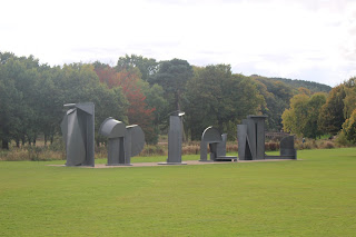
Some pictures of sculptures I took on the trip.

My initial experiments and what I found worked and didn't work.

Joan Miro's ideas and why I liked what he stood for and how it links to YSP.

Final Symbol and what makes it unique and stand out.


Peers Feedback
  • Range of logos- good to see if ideas would work.
  • Good research on artist and incorporating it into work.
  • Good research into artist and how his beliefs intertwined with the park.
  • Clear about initial ideas and styles
  • Detailed research worked well into the work 
  • Possibly add more development and different possible outcomes and justifications
  • Strong design, possibly look into colour
  • Specific sculpture inspiration
  • Good, clear, simplistic logo
  • Good reasons why you choose the sculpture
  • Symbol is good, could it be used with colour
  • Good variety of symbols and recognition
  • Good research 
  • Type didn't suit your symbol
  • Good that you kept with the theme
  • I like the tribal feel to it
  • Would be nice to see colour within the logo to represent busy family atmosphere that the park has
  • I like the abstract final design, How did you get there? 
  • I like the negative space and how it works on a small and large scale
  • Good use of words such as abstract and simple
  • Good use of negative space
  • Good initial ideas
  • Good research 
  • Very simple but effective
  • I like the negative space
  • Natural line representational of the park
Tutor Feedback
  • Good identification of sculpture forms over nature.
  • Good Combination of nature and sculpture.
  • Would be good to explore a range of approaches.

Thursday, October 15, 2015

YSP Symbol Task

Today I looked through a book called Symbol by Angus Hyland and Steven Bateman for some inspiration for my Yorkshire Sculpture Park task.
I looked into landscape symbols one that particularly stood out to me is one for Monier construction, Made by Coley Porter Bell, An illustrative landscape for the 'world leader in quality roofing' suggests their specialism. I like this logo due to the simplicity of the lines and how it is still easy to recognise even through it so basic.
I also looked through the plant, leaves and tree symbols and came across some styles I liked such as Tertti Manor hospitality, Trinity Dental Healthcare and Greenwoods clothing and accessories.


My Experimentation
I looked at some of the sculptures I liked the best and created silhouettes and looked at negative space. I also tried some ideas with leaves as I really liked looking at the autumn coloured leaves falling and the park had lots of different types of leaves. One of my least favourite designs was the rabbits as they look to strange and don't fit the vibe of the park. 


My final design is based on one of Joan Miro's sculptures. Miro was keen that his works be shown in the open air where the experience of them is altered and heightened not only by different light and weather but also by seasonal changes to the surrounding trees and plants. I think the Yorkshire Sculpture Park represents this with all of the sculptures and nature mixed together as one.
I found a pattern which I liked on one of the sculptures. I like the design for the symbol because it is unique and stands out from other park logos. It could be on its own or added into a circle like what the symbol YSP already has. I also think that this logo looks good in different scales and is memorable.


Yorkshire Sculpture Park Visit

Today I visited Yorkshire Sculpture Park with my graphics group to help my research as I am creating  a symbol for that place. I took pictures of some of the sculptures and looked into the artists as this could help with my symbol designs. We also had a lecture looking at symbols and what makes them good. I like the symbols with a good use of negative space such as FedEx, Food writers and Tour de France. When creating symbols I will look at negative space, silhouettes, angles and shapes.
 Bob and Roberta Smith
Art Makes Children Powerful 2013
This expresses Smith's concern with the diminishing role of the arts and design in schools and his opposition to former British Education Secretary Michael Gove's proposed removal of Art from the GCSE core curriculum in England. It aims to raise consciousness against the establishment and appeals for political action.


Niki de Saint Phalle
Buddha 2000
In 1994 Saint Phalle began to paint less, increasingly working with sculpture and mosaic techniques. As shown in Buddha, she used mirror, glass and stone to create vivacious, glittering sculptures on a monumental scale.
 William Turnbull
Large Horse 1990
Large Horse takes the shape of the adze, an arched, axe-like tool. Turnbull reworked the figure of the horse though out his career, reducing it to its basic form. Turnbull offers a new interpretation on the theme of the horse in sculpture. Large in scale, the work conveys a graceful innocence, suggesting movement more than power.


Jonathan Borofsky
Molecule Man 1+1+1
Jonathan Borofsky believes that his role as an artist is to ask questions about human life. He has created many works for public spaces, arguing that our view of art should not be limited to the experience of looking at a picture in a gallery. 'Originally, I was fascinated by this molecule idea because of the simple fact that even though we appear to be quite solid, we are in fact composed of a molecule structure which, in itself is mostly composed of water and air'


Joan Miro
Miro has many sculptures in Yorkshire Sculpture Park. Miro was keen that his works be shown in the open air and especially in a natural setting where the experience of them is altered and heightened not only by different light and weather but also by seasonal changes to the surrounding trees and plants.


Julian Opie
Galloping Horse 2012
Opie's work investigates the idea of representation and the means by which images are perceived and understood. Galloping horse uses reductive process to reinvent the classical equestrian sculptures frequently seen around cities. 'There is a poetry where nature and people meet technology. The scrolling of LED numbers on a currency exchange board can be like sunlight sparkling on water.'


Poppies : Wave


I also liked all the colours and shapes of the many trees throughout the park, I will experiment with a leaf shape for the symbol.