I began with some research into the company looking at things I liked and disliked. I also looked into the history of the company behind the stores here is some things I found:
- T.K.Maxx is ran by a company called TJX which has history back to 1919
- TJX also run the shops Marshalls, Home Goods, Sierra, Winners and Homesense.
- T.K.Maxx was founded in 1976 and now has 973 stores
- The reason why the American stores are called T.J.Maxx but the European stores are called T.K.Maxx is because they changed it will to stop confusion between the TJ Hughes stores.
- They have stores in America, UK, Ireland, Germany, Poland and Austria
- They have departments within their stores such as Women, Men, Kids, Toys, Home and Gifts.
- They Buy from big labels and top brands
- They claim they are not an outlet store
- They buy throughout the year and have items arrive throughout the week.
- They rapidly change assortments to create the treasure hunt shopping experience.
- Generally they sell up to 60% RRP
- Stores are flexible and have no walls between departments.
- They do charity work 'Globally, we have an amazing history of giving back and its the heart of how we do business'
- They conduct their business with integrity.
- 'Exciting treasure-hunt shopping experience'
Some things I do not like about the company
- 'We love our bright modern stores and our lean, no frills way of working'
- 'So don't expect fancy extras in our stores just amazing brands, fashion, prices and quality'
The reason I do not like this branding is because sometimes when you go into the store and it is modern and simple and sometimes a bit messy and jumbled up it makes the store brands look cheaper than their designer labels which can hurt the company. I feel like it would benefit the brand to be more formal and high end but still keep its low prices. I also think they could use a name that is international and can be used for all of their stores.
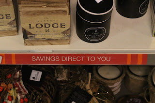
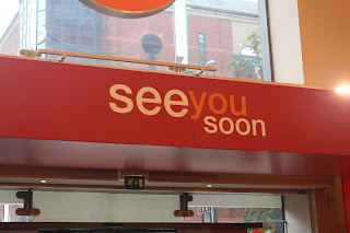
To get a better idea of the identity of the company I visited the leeds branch and took a few pictures.
The store had a colour scheme of red, orange and white, there were also a lot of circles and everything was very open plan. The Upstairs contained gifting and women's clotheing and downstairs
was men and children's clothes and home ware.There was a lot of typography and signage in the place, and they were constantly showing their main selling points. They also tried to make there store personal by having a sign that read 'Love Leeds'. The shop comes across as very homily and family like due to its range of products.


No comments:
Post a Comment